Restaurants
The owner. A leak closes the kitchen.
One number to call, a technician within the hour.
Case study · Plumbing · Paris
A Paris plumbing network that does the job well and grew on word of mouth. The people who sign maintenance contracts had never heard of it. In three months, the campaigns opened over EUR 50K in business opportunities.
The challenge
Plumbing in Paris is bought in an emergency, and ads on those searches cost more than the job pays. The profitable business is elsewhere: maintenance and service contracts with restaurants, office buildings and the property managers who run dozens of addresses. Nobody was writing to them.

What we did · The targets
Paris first, then the inner suburbs, one district at a time.
The owner. A leak closes the kitchen.
One number to call, a technician within the hour.
One person who runs the building for everyone.
One contract, no more three quotes per incident.
They sign for a whole portfolio at once.
A network that covers all their addresses.
What we did
Sent from addresses built for it, at a pace that keeps them healthy, with follow-up that does not stop after the second message.
The handover
So that a contact who looks the network up sees the same promise as the message. The search side came after, once outbound paid for it.
Brand identity · Réseau Tubulure
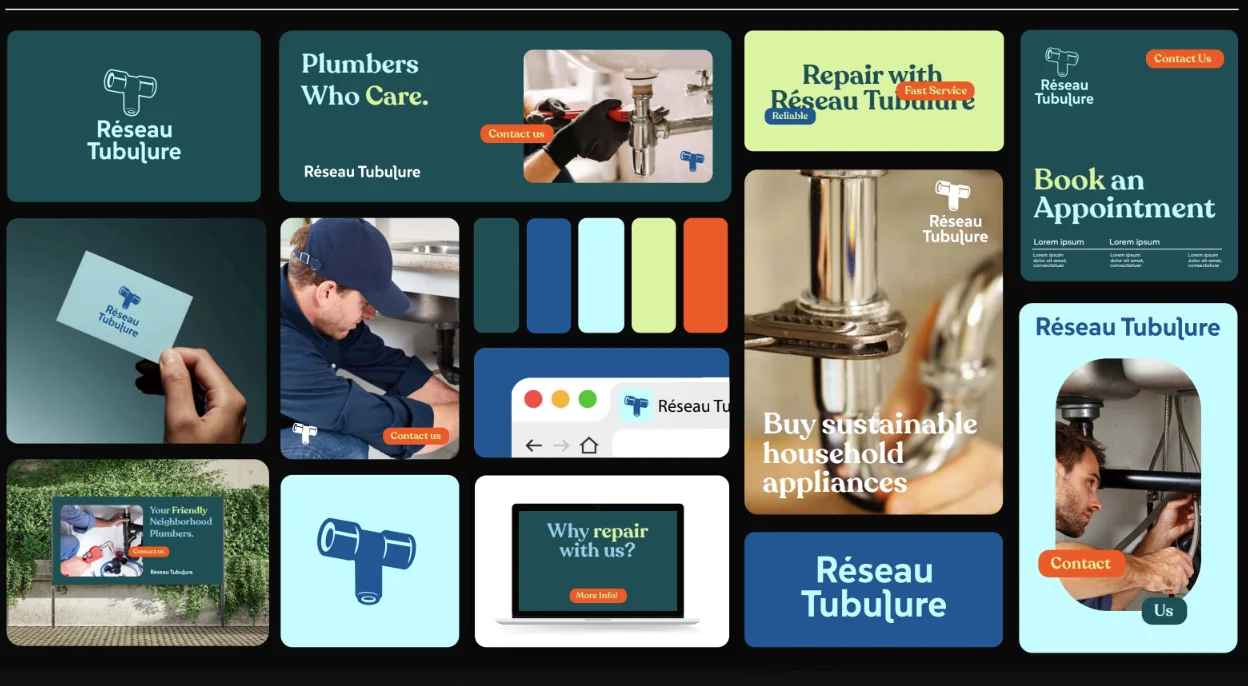
The existing identity already formed a coherent system: a pipe fitting symbol, a blue palette and a direct, approachable tone. The question was how to make the name itself more distinctive while keeping the clarity people already recognized.



A visual language
The logo studies sit alongside a broader exploration of color, type, photography and layouts. The concept shows how the identity can stay consistent from a small icon to a full page.
Across touchpoints
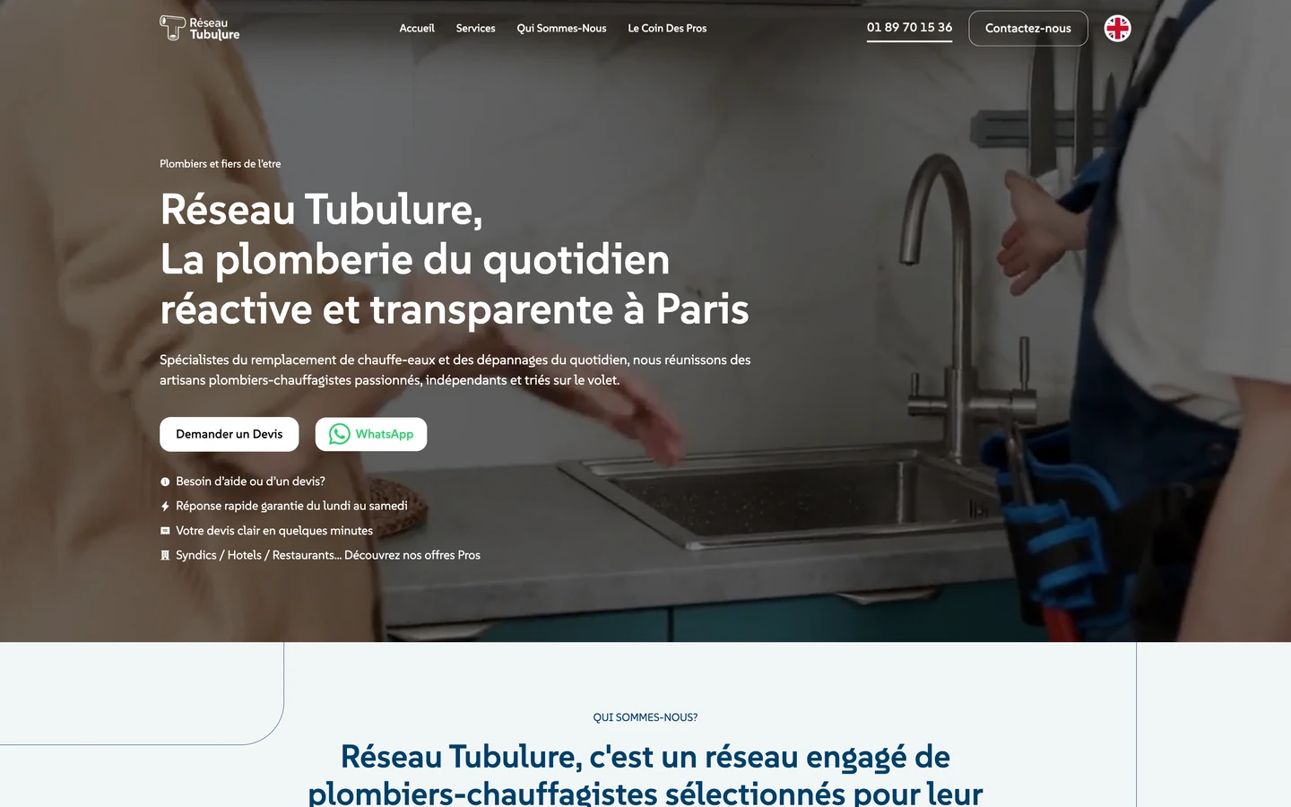
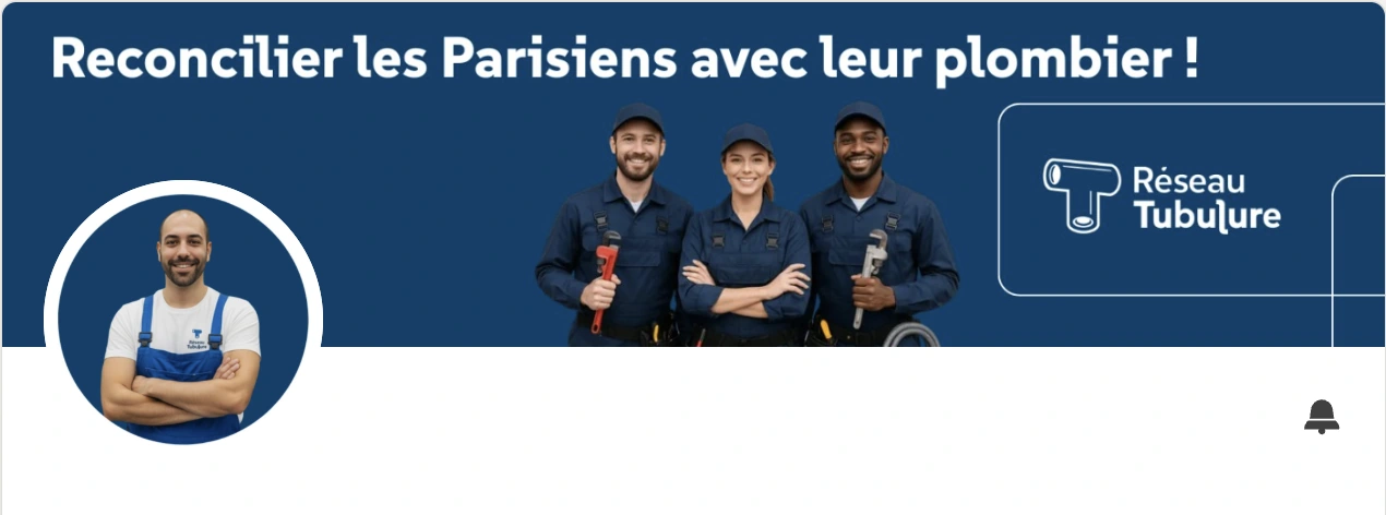
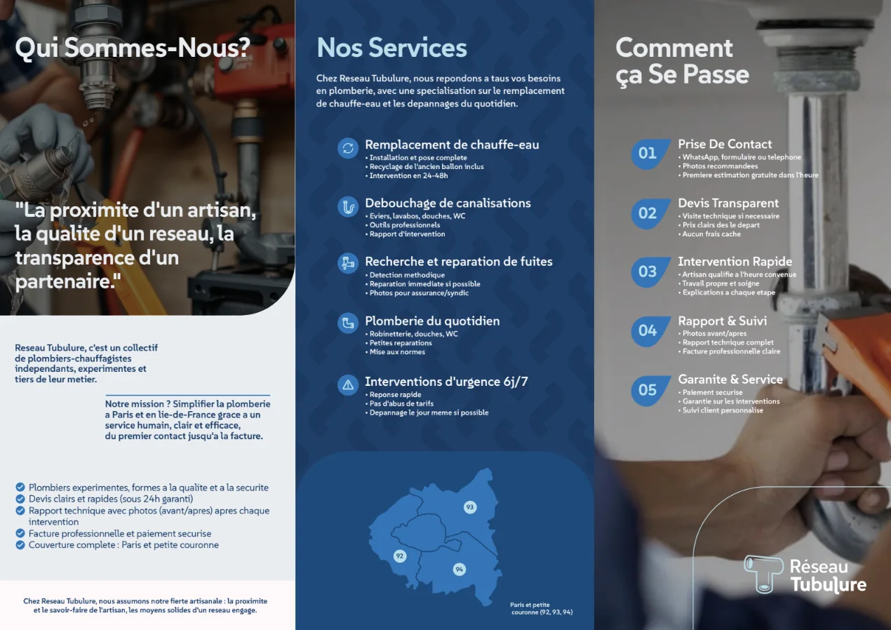
The live website and LinkedIn profile share the established visual identity. The brochure is a simple layout study for presenting the service in print.
เล่าให้เราฟังเกี่ยวกับข้อเสนอ ตลาดเป้าหมาย และผู้ที่คุณต้องการเข้าถึง เราจะร่วมกันหาก้าวแรกที่ทำได้จริง